Time series data visualization made easy for Excel users and R programmers. ![]()
![]()
Installation
- Download RStudio or R.
- Open RStudio or R, and install the package
devtoolsif you don’t have it already:install.packages("devtools", repos = "http://cran.us.r-project.org")As an alternative to
devtoolsyou can useremotes. - With the
devtoolspackage you can installnicerplotdirectly from github.devtools::install_github("data-science-made-easy/nicerplot")
Congratulations, you now have the cutting-edge development version of nicerplot!
In some cases, however, e.g. if you want work on common version together with others, you may prefer to install a stable release. In that case you can add ref = <tag>, to the above install_github command. You can find the tag left of the release (e.g. ref = 'v0.1.2').
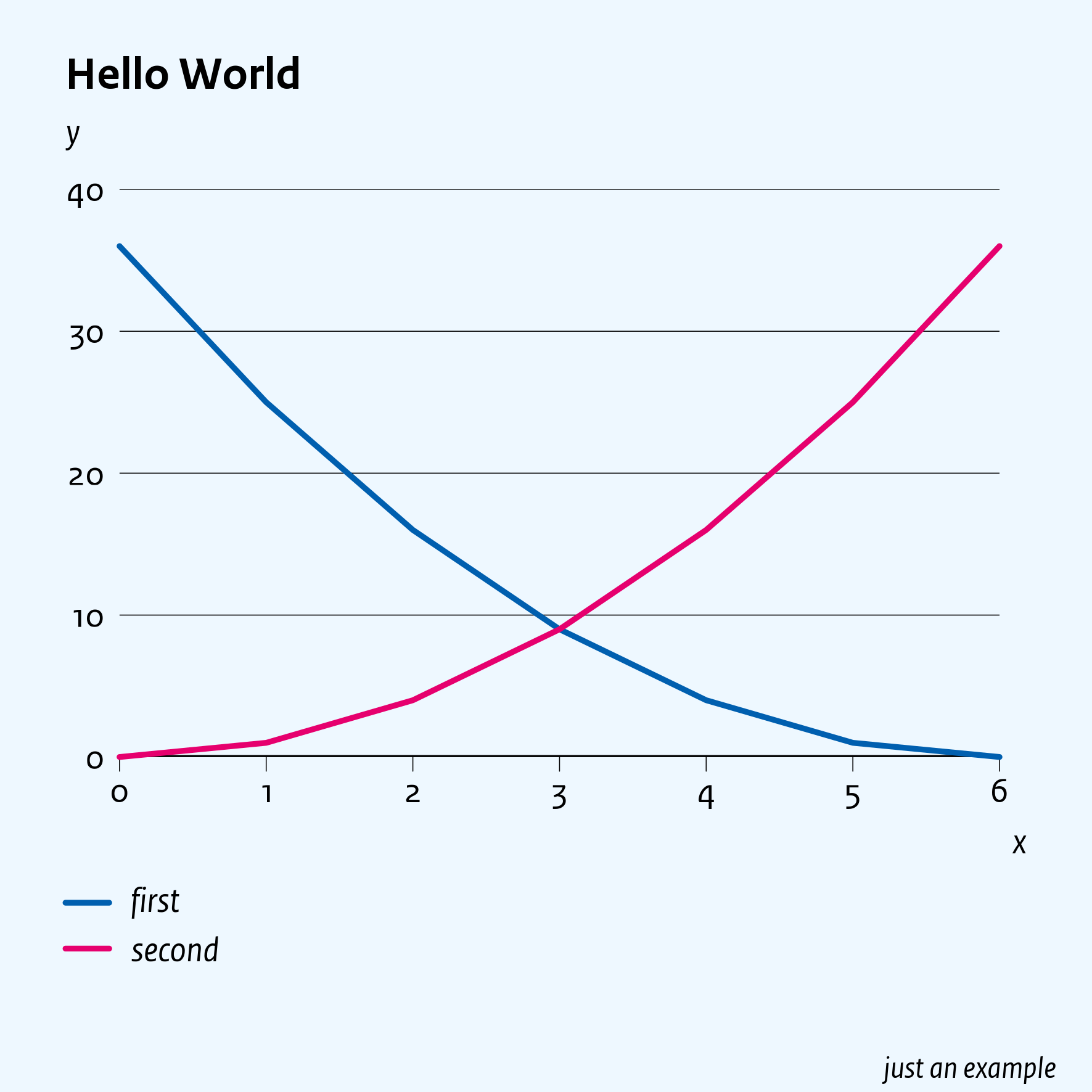
Hello World example
The example below defines a data.frame with two series of data:
x <- 0:6
d <- data.frame(x, first = (6 - x)^2, second = x^2)
nicerplot::nplot(d, title = 'Hello World', x_title = 'x', y_title = 'y', footnote = "just an example")
This generates a figure in./generated/hello-world.png in your working directory (see: getwd()):
Nicerplot can visualize data in the following objects:
data.frame, see the above examplematrix, similar todata.framets,mts, (multivariate) time series objectscharacter, if it is a ‘path/to/an-Excel-file.xlsx’- e.g.,
nplot('hello-world.xlsx')reproduces the above figure (first download hello-world.xlsx)
- e.g.,
character, if it is a URL that points to data on Statistics Netherlands- e.g.
nplot('https://opendata.cbs.nl/statline/#/CBS/nl/dataset/83913NED/table?dl=323FD', title = 'Dutch housing market', y_title = 'prices (2015 = 100)', hline_bold = 100, file = 'url-example')plots actual house prices and saves it as ‘url-example.png’
- e.g.
list, with elements of the above objects and/or a ‘sub-list’
The manual explains in great detail how to structure the above objects well.
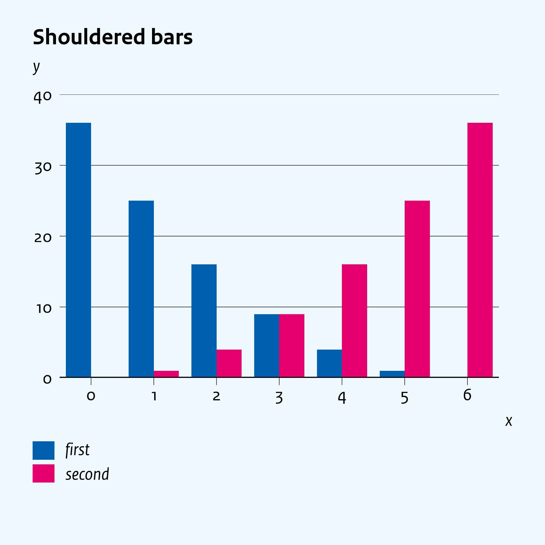
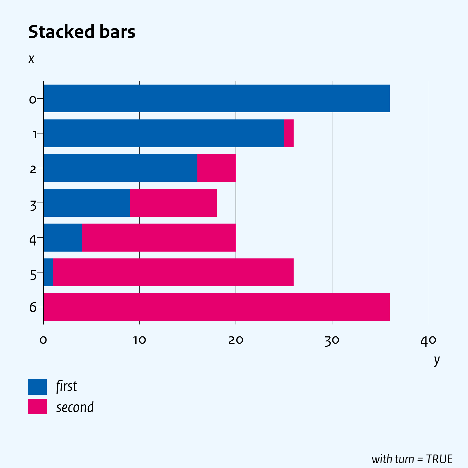
Change the layout
Instead of lines you can plot ‘stacked bars’ by using parameter type = 'bar=' (use type = 'bar-- for shouldered bars):
library(nicerplot) # this exports function 'nplot()'
nplot(d, title = 'Shouldered bars', x_title = 'x', y_title = 'y', type = 'bar--', file = 'Hello-World-shouldered-bars')
nplot(d, title = 'Stacked bars', x_title = 'x', y_title = 'y', footnote = 'with turn = TRUE', type = 'bar=', file = 'Hello-World-stacked-bars', turn = TRUE)
Manual
The manual provides many other examples. Below each figure in this manual you can find the R-code to reproduce that figure with this package.
Details
The default
- font is ‘RijksoverheidSansText’. If that font is unavailable, ‘sans’ will be selected.
- language is Dutch, so the decimal (thousand) separator is a comma (point). Use
style = 'english'to swap those two separators.